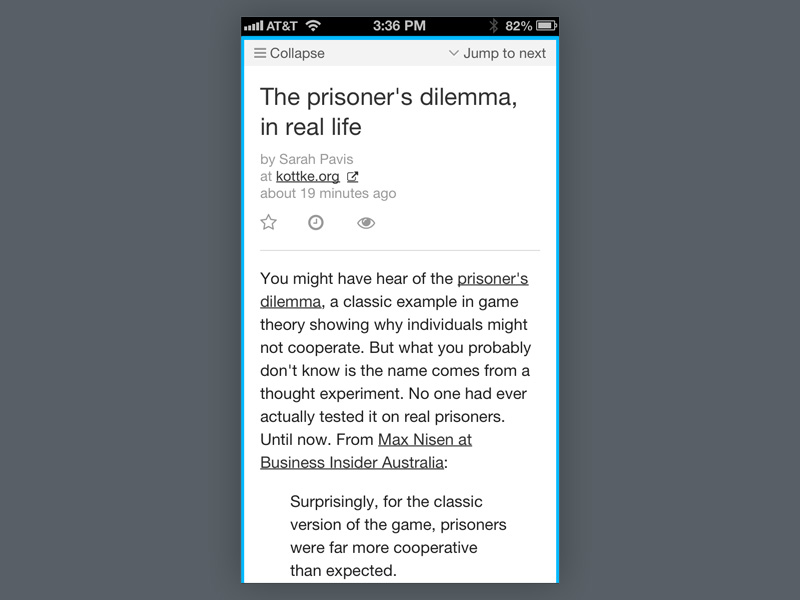
Experimenting with the responsive layout of MnmlRdr's (https://mnmlrdr.com) expanded article view, specifically typography and treatment on mobile devices. I still don't like the placement of the action icons (star, read later, keep unread) but there doesn't seem to be much room anywhere... What do you think?